The story a top-ten hides
A year of listening has a shape. The week you played one album to death, the month a new artist quietly took over, the hour of day you actually reach for music. Streaming apps flatten all of that into a ranked list once a year, on their schedule. I wanted the shape back, so I built my own instrument to read it.
Reading a year at a glance
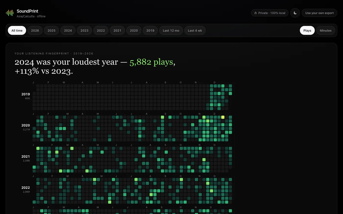
The spine is a play heatmap. A year of days, each lit by how much you listened, so a loud run and a fallow month are legible before your eye touches a single figure. The headline is written from the data itself, the loudest year, the jump against the year before, so the surface says something true the instant it loads instead of making you dig for it.
Time, not just totals
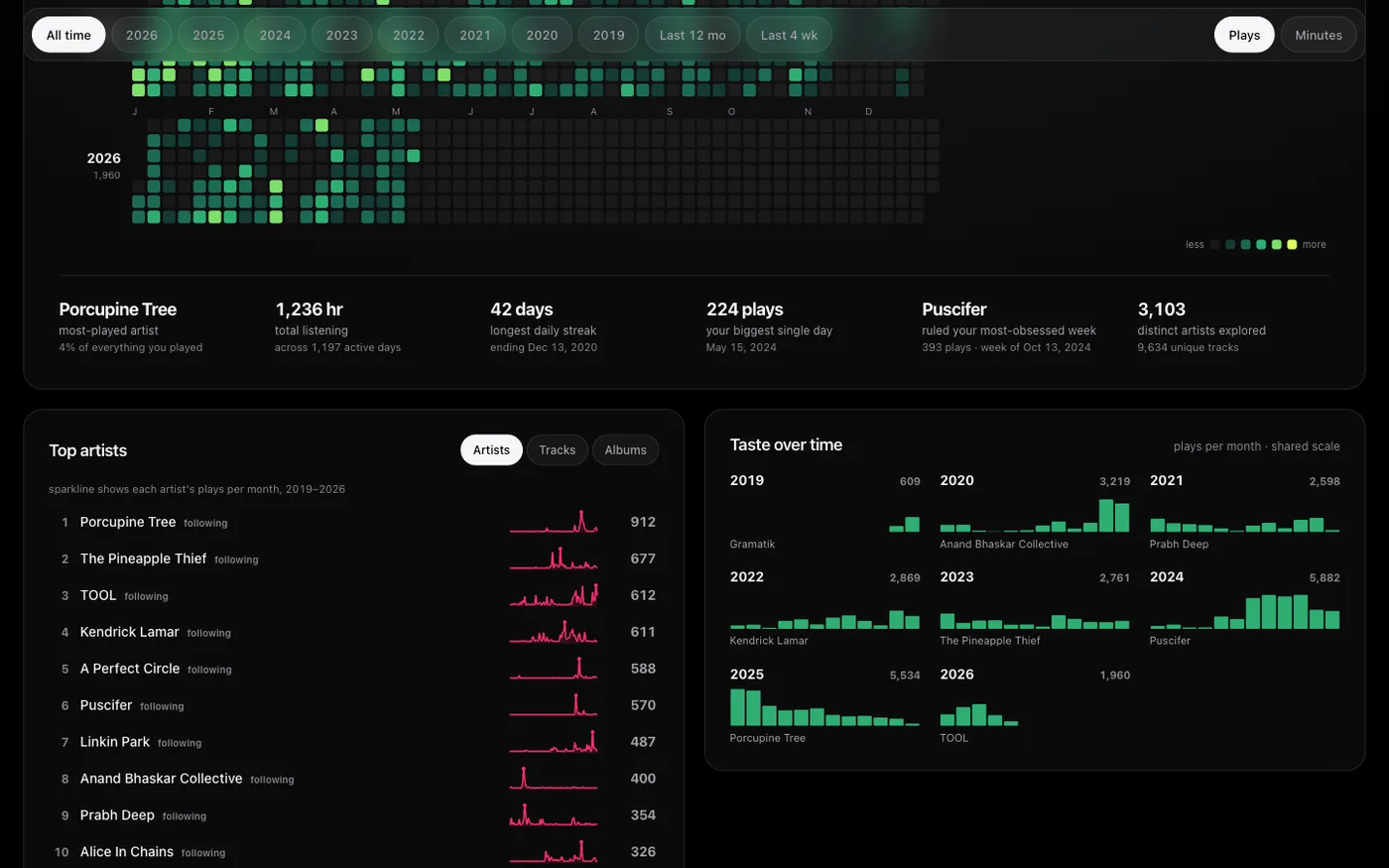
Totals are the least interesting thing about how someone listens. So the surface leans on time: listening by hour of day, a circular clock of when music happens, the balance of discovery against repeat, streaks and loyalty to a handful of artists. Each chart is pointed at one question. Together they read less like a report card and more like a portrait.
A rewind on your own terms
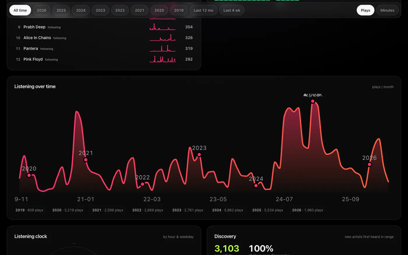
The end of it is a rewind and a share card. The difference from the yearly version everyone knows is small but it is the whole point: this one is something you assemble and open whenever you want, from your own history, not a package delivered to you on someone else’s calendar.
What it taught me
The craft here was restraint on a dark canvas. A lot of neon is a temptation and a mistake; every chart had to earn its colour and carry its own question without a charting library doing the thinking for it. Data visualisation is really editing, deciding what not to plot so the one true thing in each panel is the thing you see first.
Interested?
I kept this one link-free on purpose, but I am happy to walk anyone through it. If personal data as a story is your kind of thing, write to me or find me on the contact page.