








FOLO
A NetWorth app helping Indian families see their entire financial life clearly in one place.
- May 2023The brief
Sharpener Design joins Finuture to make finance simple for women.
- 2023The reframe
Research redefines it: finance does not have a gender. FOLO becomes for one and all.
- Late 2023The seed
Early Figma prototypes anchor the ₹10 Crore seed round.
- June 2024Full time
From agency engagement to Founding Team Member and Principal Product Designer.
- June 2024The studio
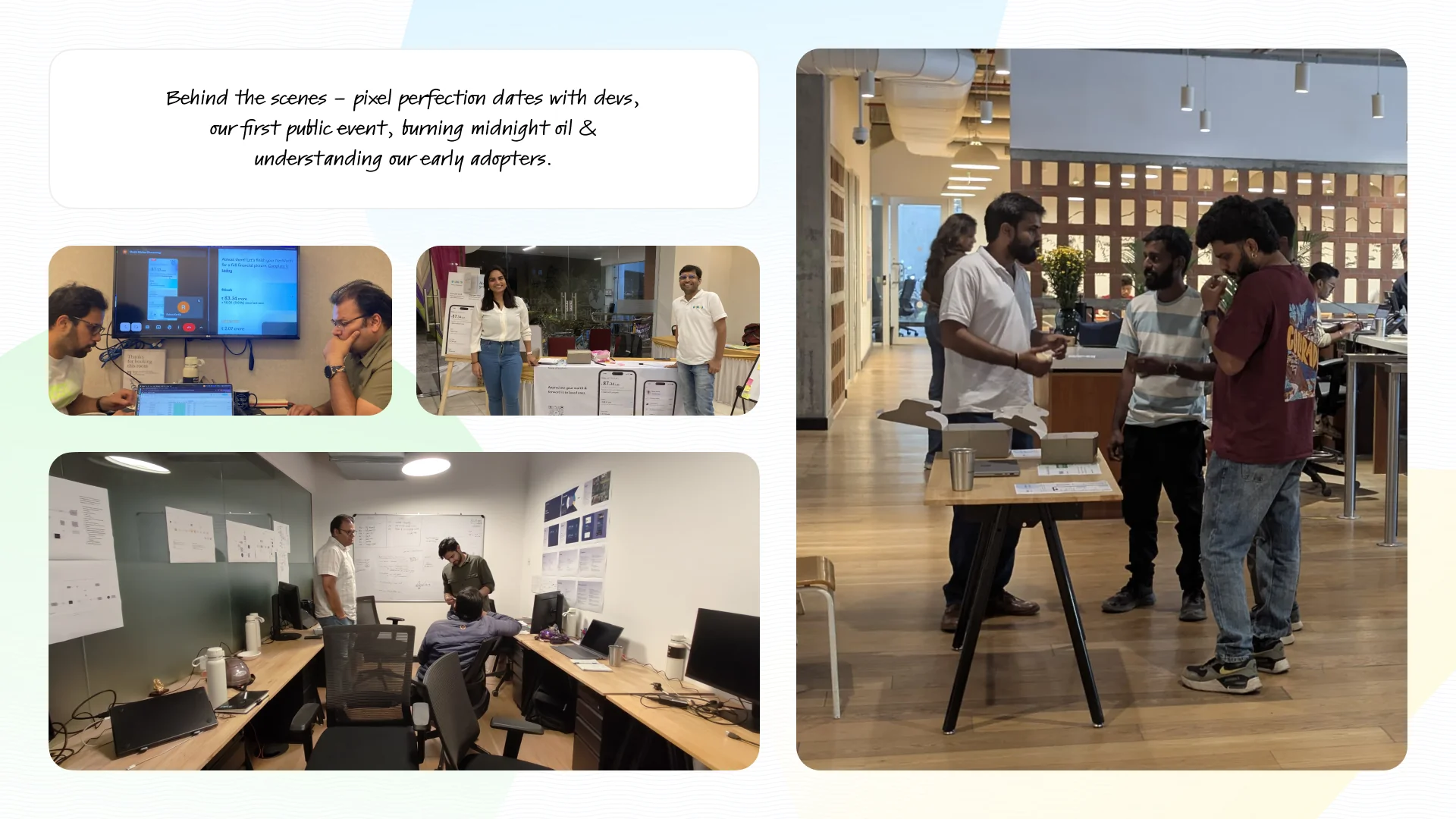
The team sets up at WeWork Bellandur.
- March 2025Launch
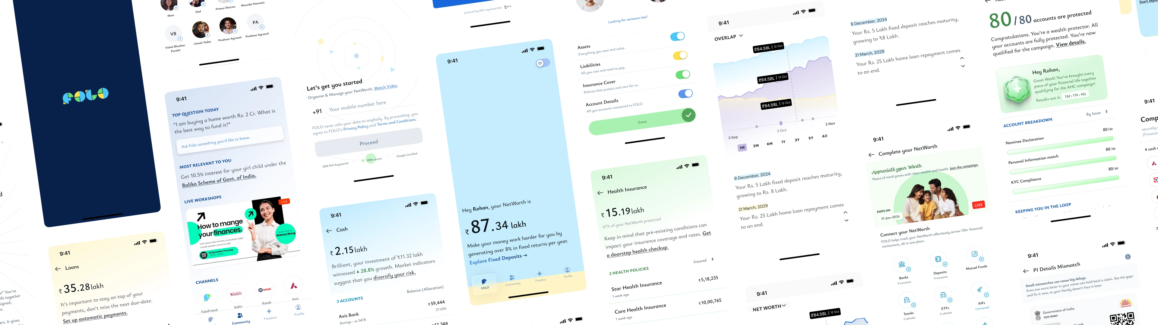
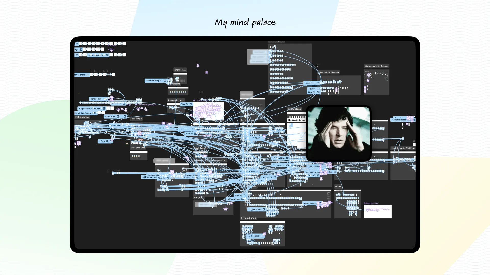
FOLO ships as a system: 22 flows, 90 screens, 318 states.
- May 2026One lakh families
1 lakh downloads, 4.5 rating, ₹15,000 Cr+ connected wealth.
A family's financial mirror.
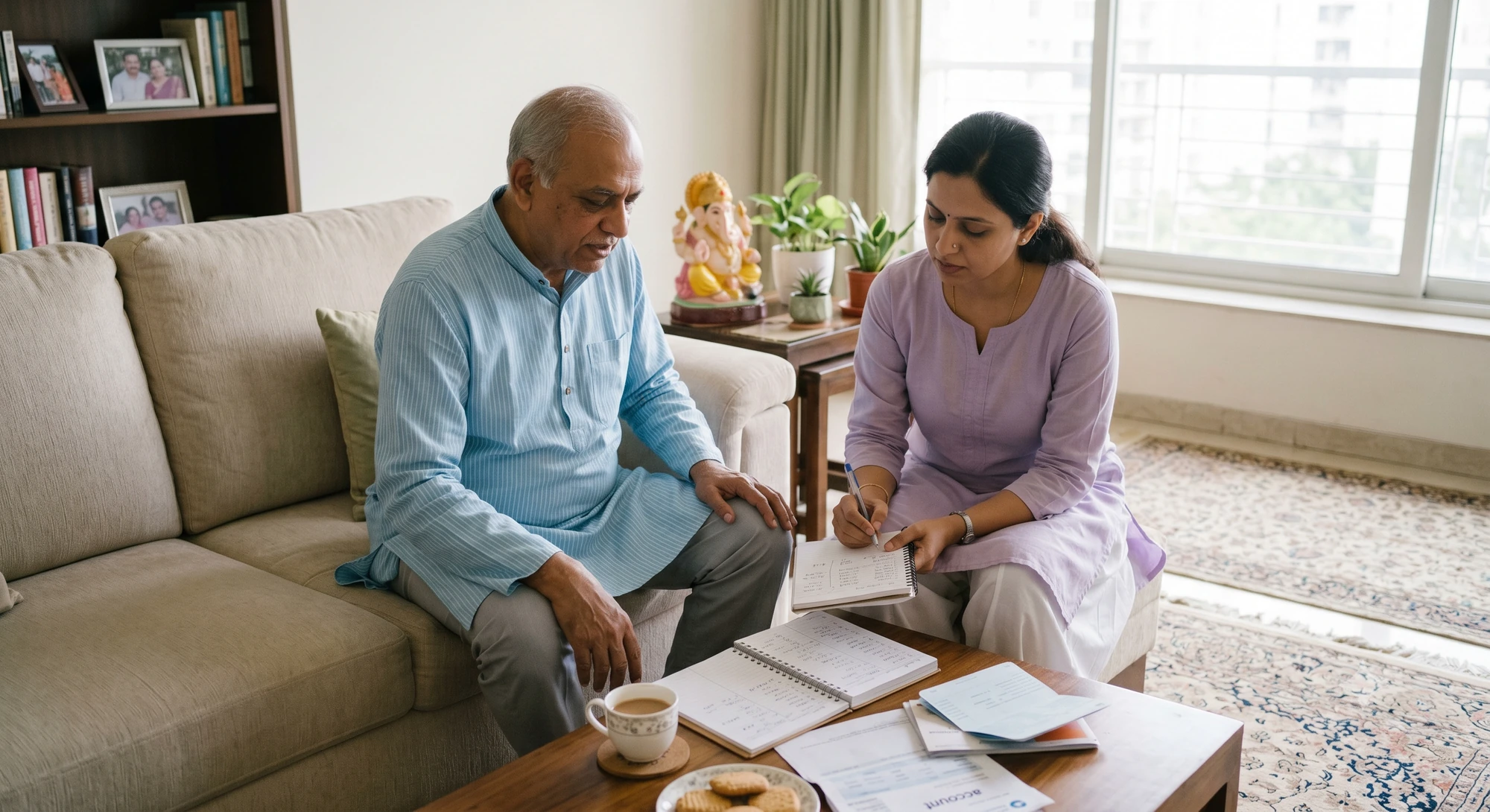
A Sunday afternoon. Shruti sits with her aging father, writing down every account he owns, having the difficult conversation while it's still possible. That preparedness is what I helped design for.
FOLO is one of India’s first NetWorth apps built to help families organise, manage, grow and propagate their wealth. The design problem was to build trust through consent, make comprehension easy, and establish a sense of emotional safety.
About 2 lakh crores is unclaimed.
Most Indian families have no shared view of their financial life. The information exists, scattered across spreadsheets, forgotten logins, and papers in a drawer hardly anyone knows about.
The cost surfaces at the worst moment. When someone passes away, the family has to search under stress. Some assets show up in weeks, many are never found. In October 2025 the Finance Ministry put unclaimed financial assets at ₹1.84 lakh crore and launched a national campaign to return them.

Every rupee has an heir. What is missing is a single living record of a family's money, built while everyone is still around to explain it.
India had built the rails: Aadhaar for identity, UPI for movement, the Account Aggregator framework for consent, cheap data and a smartphone in nearly every hand. The rails were ready. The product a family could actually use was the genesis of FOLO.
Finance is for everyone.
How can Indian families organise, manage, grow and share their NetWorth in a secure and private way? That felt a problem space worth spending years on.

How I came to design FOLO
Sharpener Design joined Finuture Technologies in May 2023 to make finance simple for women. Through problem discovery and user research, I redefined the approach: finance does not have a gender and everyone struggles equally, so FOLO became for one and all.
Munmun Desai brought the financial depth and founder conviction, Vishal Purohit the systems mind. My job was to turn that ambition into a product language people could trust. The early Figma prototypes anchored the ₹10 Crore seed round.
The design thesis
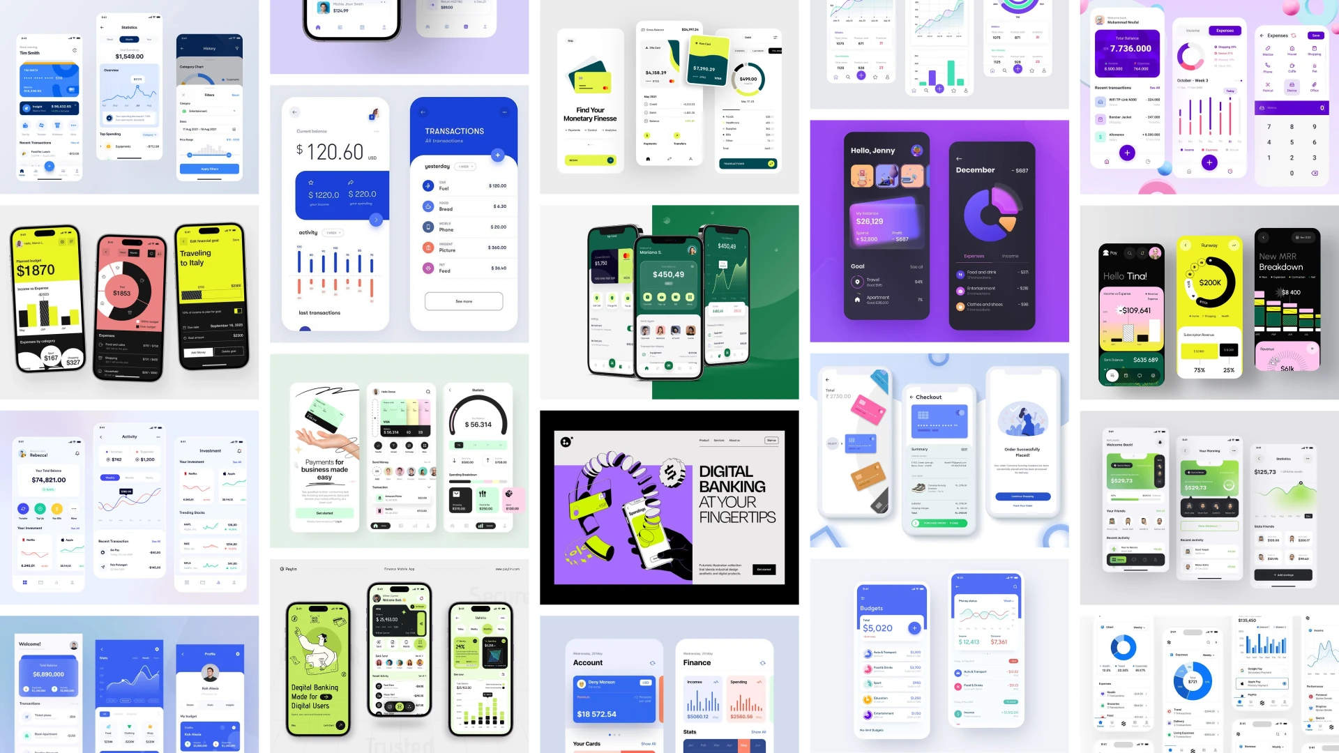
Open most finance apps and you meet the same room: cards on cards, graphs climbing and falling, numbers competing for attention. FOLO refused that posture. The user was coming to ask one simple question, how am I doing? NetWorth is the slow arithmetic of a life. It deserved a calm instrument.
I graded all 800+ screens on two numbers of our own: an easy score for how well it worked, a wow score for if it felt like magic. Nothing shipped soft.
Building the brand.
FOLO is an acronym for Family Of Loved Ones. Every decision was tested against four words. In the writing they became one voice: friendly, simple, warm, assuring, responsible.
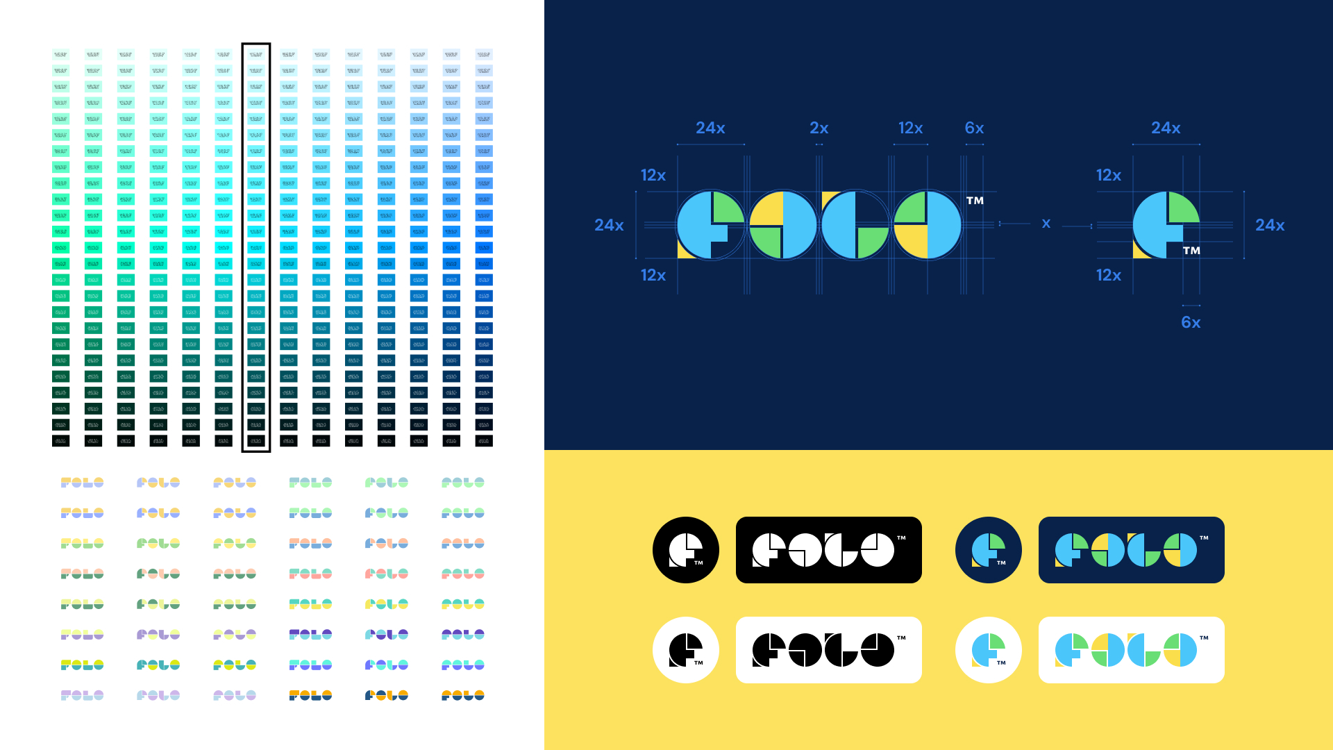
The logo began as an F drawn from bars and arrows reaching for growth. It landed somewhere gentler: a wordmark made of rounded pie-chart-like forms in the system's own visual language. Each hue was drawn into a full tonal ramp and carried everywhere, from the net worth screen to the certificate.
Paint it blue.
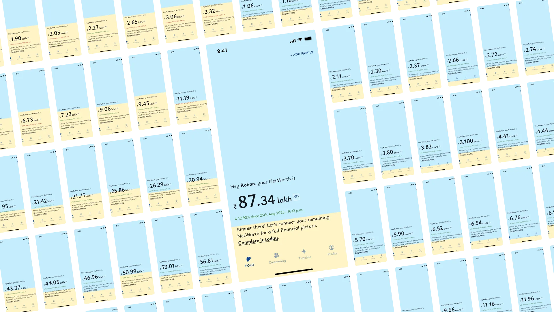
The hardest call was keeping graphs off the net worth screen. One big number. Blue for what you own, yellow for what you owe, a calm greeting, nothing else.
It quietly turns into a game. Grow the blue, shrink the yellow, and watch the screen paint itself blue over the years. You never read your progress off a chart, you feel it, and a life's net worth plays out in a single ratio.
Onboarding: from a dot to a decimal
The first run opens on a single dot. It grows, splits, takes on green and then yellow, and settles into the net worth number as its decimal point. Your scattered financial life resolving into one figure. For many people this is the first time they see their whole financial life as a single number, so the motion stays quiet.
The nudges encouraged: titles under forty characters, nudges under a hundred and fifty, so warmth never turned into noise.
The month's upcoming outflows, laid out so a family can plan around what is due. The hero screen's philosophy applied to time.
One small insight at a time, real questions answered with peer context. The design job was making comparison feel like company.
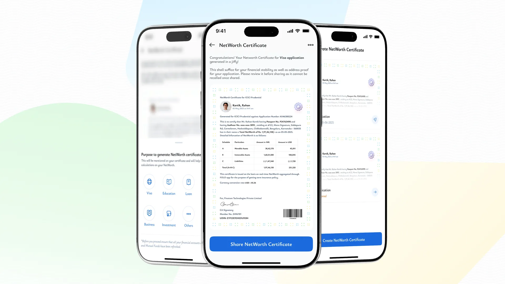
The core value as a formal document for a visa or a loan. The indigo seal carried the product's authority into an artefact.
Trust had to live in the interface.
Designing trust through consent
FOLO connects the most sensitive data a person has, so trust could not live in a privacy policy. It had to live in the interface. SEBI regulated, AES-256 encrypted, connected through the RBI Account Aggregator framework via Finvu, MF Central, and EPFO, across five hundred plus institutions, and the product says so on the surface.
Sharing was never a quick tap. The copy rewrote itself with the selection: "Priya will see your Assets and Insurance." A privacy setting, turned into a sentence about a person. The commit is deliberately slower than a tap, because a sensitive action should never feel accidental.
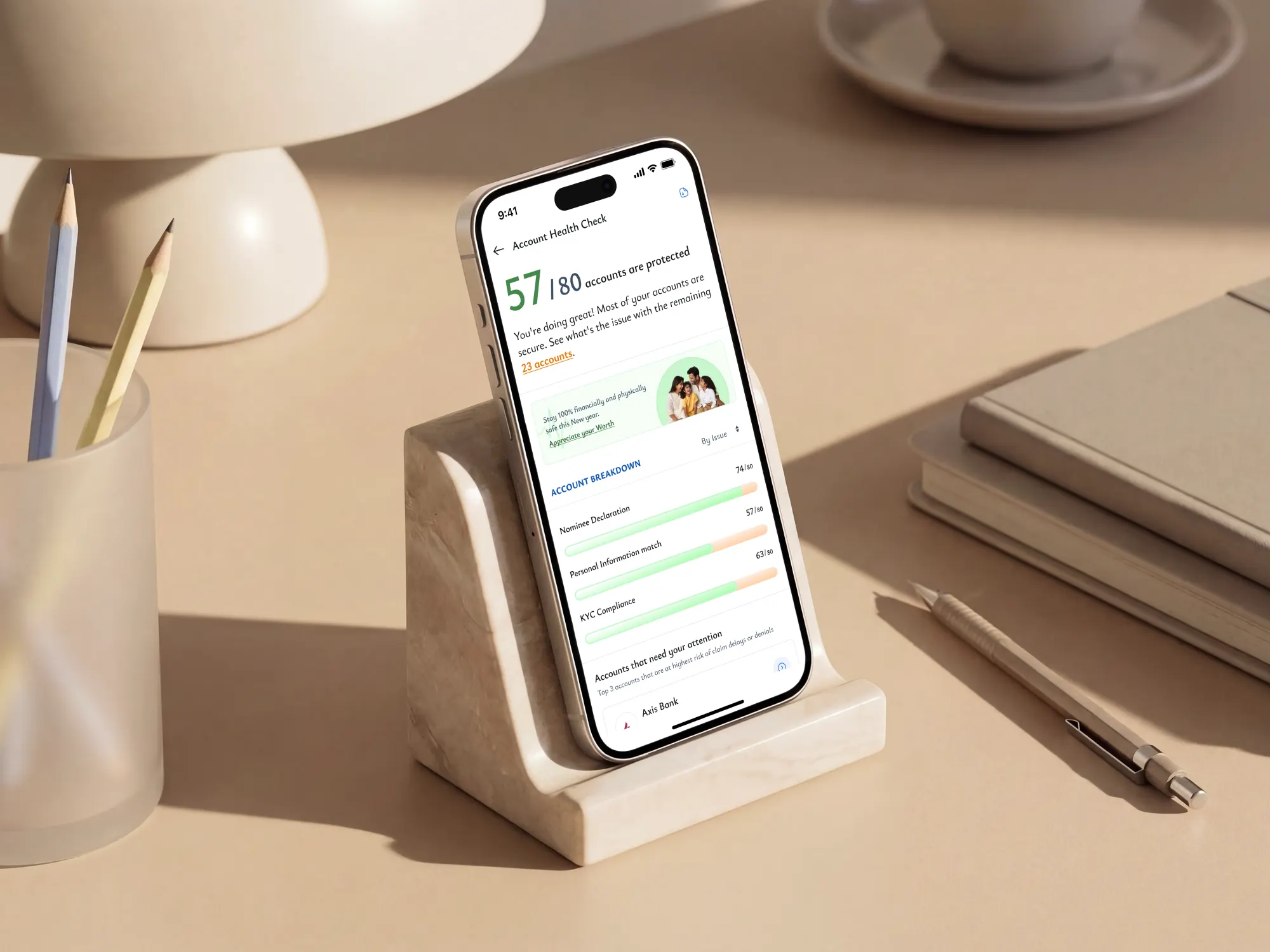
Fix the gaps before your family has to
₹1.84 lakh crore stays unclaimed because the gaps stay invisible until the worst moment. Account Health Check surfaces them while everyone is still around to fix them: nominee gaps, missing details, the cracks that quietly become a family's problem later. The hard part was tone, because a health check can feel like an accusation.
As the product matured it answered its two organising questions out loud. "Where do I stand?" became a sixty-second health check. "How am I doing?" became its forward-looking twin.
Let your NetWorth carry on.
LYNC is the legacy service that grew out of FOLO. When someone dies, the family is pulled into a second job nobody asked for: working out what the person owned, claiming it, and proving they are allowed to receive it. LYNC does that work with them.
- DiscoverFind the accounts, loans and insurance policies the family did not know existed.
- PlanA personalised checklist and roadmap for the transfers ahead.
- ClaimLocate the insurance policies and carry the filing through.
- TransferMove bank accounts, mutual funds and stocks to the rightful claimant.
- CompleteOne guide stays with the family from discovery to the final transfer.
A screen is not enough at the worst moment of a family's life, so the heart of LYNC is a person. A care partner, an in-house specialist, is assigned to the family and guides them from the first call to the final transfer.
The same service runs behind life insurers, corporates and hospitals, who reach families at exactly the moment this help is needed.
"We manage the complexities, you cherish the memories."
Shipped as a system.
Three pillars, product, communication, brand, one locked language underneath. I also owned the build and measurement side: every FOLO and LYNC website, and the performance dashboards the team read them by. The rigour is invisible in the final product, which is the point. Roughly 85 percent of people completed the optimised onboarding flow. The traction came from giving people a clean view of something they already cared about and had never been able to see.
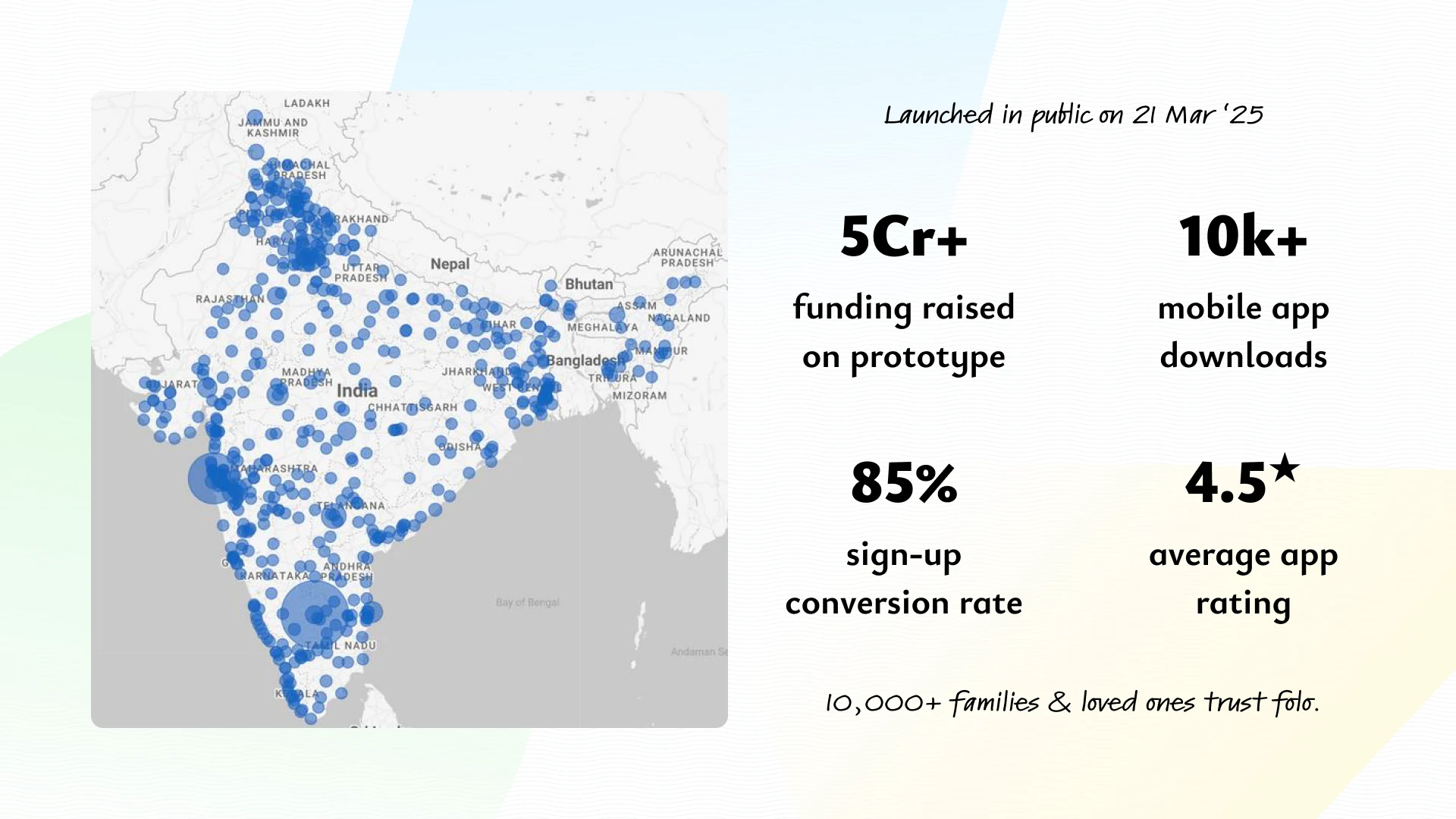
Before launch, FOLO was shaped by a close community of early users, closer to co-creation than research. The most useful signals came from the moments they hesitated. One lesson kept returning: a technically correct handoff is not enough; the user needs to know where they are going and how they get back. That shaped the Account Aggregator experience, and later became Co-create FOLO inside the product. For a product like this, feedback is a trust mechanism.
What this taught me.
Brand is what the product promises. Product is whether the promise survives contact with reality.
Every colour, word, and consent screen had to carry one idea: this is your family's financial life, and it deserves care. A country where families cannot see what they are worth needs interfaces that make the invisible visible, language that lowers fear, and products that help difficult conversations happen earlier. It starts with one family on one quiet afternoon, finally seeing itself clearly. The next family follows.